Accurate description of effects is not hair-splitting; it is much-needed exactness to avoid adding confusion to an extraordinarily complicated and tense scientific and societal debate around COVID-19 vaccines.
It does not mean that 95% of people are protected from disease with the vaccine—a general misconception of vaccine protection also found in a Lancet Infectious Diseases Editorial.
This appeared in correspondence in a March 8th publication through The Lancet, a leading peer reviewed medical journal. It emphasizes that even within the scientific communities focused on such issues, misunderstandings about the meaning and implications of reported numbers about vaccine efficacy persist. If the scientific community makes a mistake in its own interpretations, that can misinform policy makers, even very educated ones, and that in turn can misinform the public.
In the last few weeks I have seen evidence of articles more widely shared to correct some of the early misconceptions The Lancet correspondence was concerned about. However a more insidious form of misunderstanding and misinformation lingers, and is pervasive.
Tom is no ordinary doctor. He is the former Director of the Center for Disease Control under President Barack Obama. He is also propagating dangerous misinformation about the COVID-19 vaccines. It will cause people to misunderstand the real world results which can cause more people to die, and exacerbate the pandemic.
Dr. Tom is wrong. About as wrong you can get. The real world data has shown that the death rate among the vaccinated, if infected with COVID, can be 3 to 5.7 times higher1 than the death rate of the unvaccinated.
The former Director of the CDC is making what I call an Acceptable Catastrophic Error. This is the kind of error one is allowed to make when they are perceived to have the correct opinion. Arguments and statistics used towards the goal of getting every single person vaccinated for COVID are given far less scrutiny and are accepted as true more readily, than any arguments or statistics that might be perceived as counterproductive towards that goal.
When the former Director of the CDC, or anyone else for that matter, says someone who is infected with COVID is 100 times less likely to die if they have been vaccinated, it does not matter how far off that number is. It will be readily forgiven no matter how inaccurate. It is the goal of universal vaccination, not truth, that appears to be most important.
There are a lot of acceptable catastrophic errors.
Vaccine Efficacy
In order to understand why people are claiming these marvelous additional benefits exist, we will unfortunately have to do some math. But once we do, confusion will be alleviated, and the dangerous misinformation being spread by those in authority and those on a mission to convince everyone to get vaccinated, will become clear.
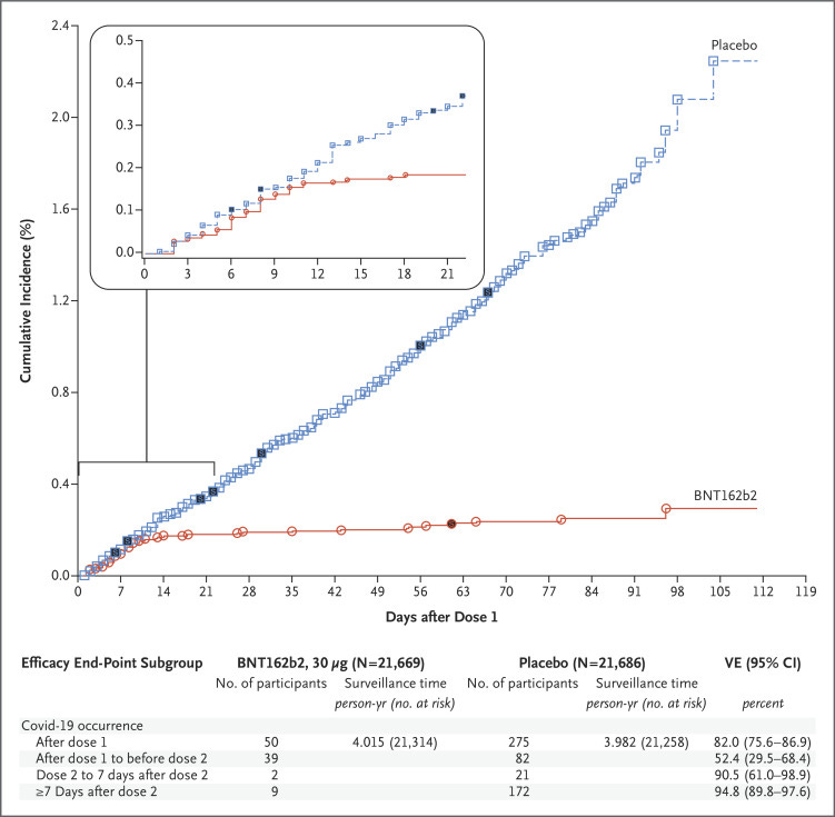
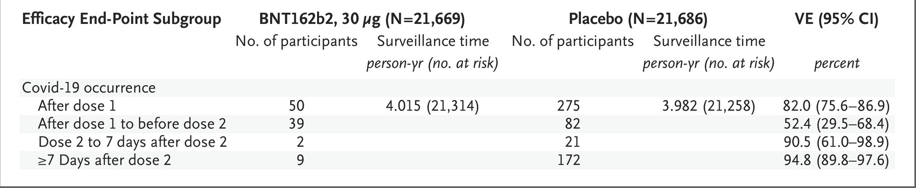
To understand vaccine efficacy, a diagram provided in the results of a Pfizer–BioNTech mRNA BNT162b2 clinical trial will be very useful.
The red line with circles shows that for those who received the vaccine, which was 21,669 people, the rate of infection slowed. The average number of days between individual infections increased. The result is that over a period of time, the total number of people who became infected was indeed far lower than the unvaccinated group.
This is where the earlier statement from from The Lancet “who would have become diseased with COVID-19 had they not been vaccinated” comes into play. It is reasonably assumed that the red line would resemble the blue line if the group were unvaccinated. Therefore one could count the number of squares on the blue line that occur in between instances of red circles, and get a ratio of how many unvaccinated people got infected per each vaccinated person over a period of time.
The efficacy rating (VE in the table) is a way of trying to do this. However one additional layer of complexity is added. Researchers treat the people in study without much distinction. Every day that a person is included in the study and observable is considered a person-day. Every person being observed on a given day is counted and added to a tally of person-days. At the end of the study, the observed infections are divided by the total person-days counted for the group.
For example, if two people are observed across four days, it is a total of eight person-days. Each person has a chance of infection each day, unless they were already infected. It makes a total of eight chances for a person to become infected. However, once infected, someone cannot be infected again, so that person stops being counted in the person-day tally. In this particular case they used a different length of time than day, but the idea is the same.
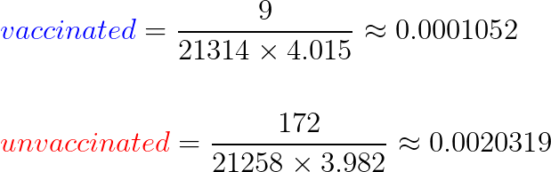
At the end of the day, the efficacy calculation is the result of counting things and dividing things counted. We can take the numbers they counted and divide them ourselves to arrive at the same efficacy numbers. Let’s use the data from ≥ 7 days after dose 2. We have 21,314 people across 4.015 time units for the vaccinated group, and 21,258 people across 3.982 time units for the unvaccinated. Now we compare the rates of infection, which were 9 and 172 observed infections respectively.
Finally, we take the two rates, and compare them, and compute a number that represents the percent score called efficacy.
There is the efficacy number from the table. Subtracting from 1 simply allows you to report a number where higher is better, instead of using “golf rules” where lower is better. The calculation itself is not misleading if you understand how it is derived. But it is important to hold on to the idea we are currently talking aboutinfection rates over timeonly. It is perfectly reasonable to compare infection rates among two groups in this way.
This distinction is all the more important as, although we know the risk reduction achieved by these vaccines under trial conditions, we do not know whether and how it could vary if the vaccines were deployed on populations with different exposures, transmission levels, and attack rates.2
Real populations
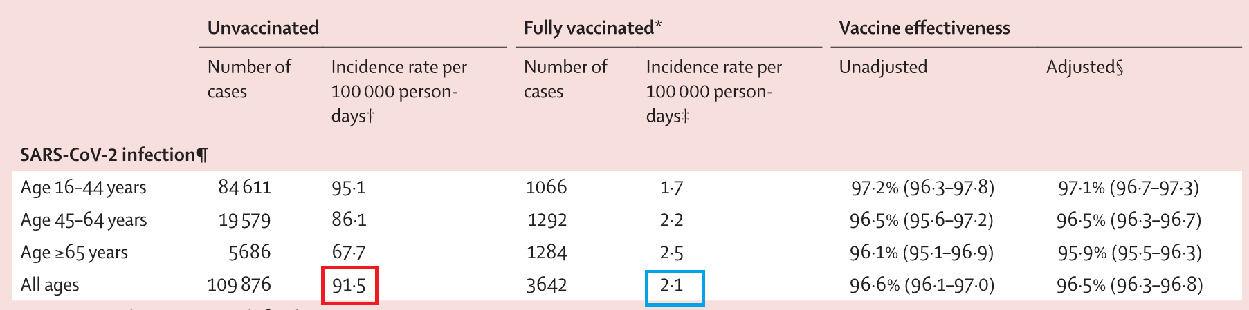
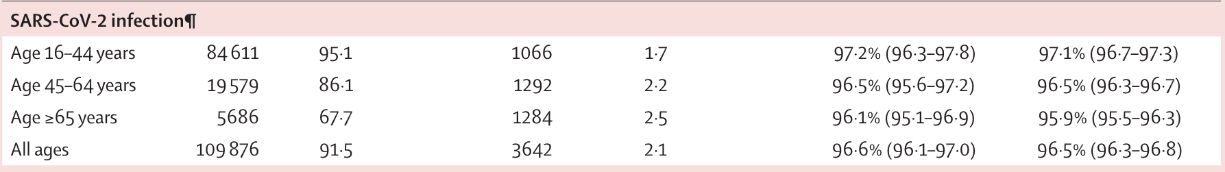
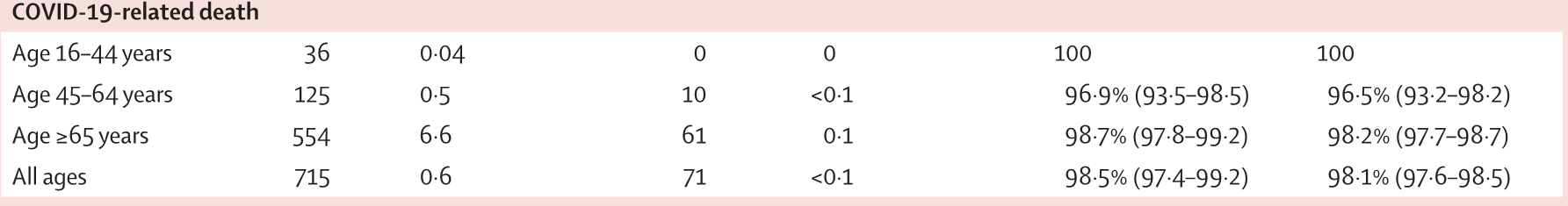
Israel offered a glimpse into the real world dynamics of the Pfizer–BioNTech mRNA BNT162b2 vaccine. A major study, published May 2021 in The Lancet, reviewed national surveillance data, collected as part of a government vaccination initiative. The data collected was able to identify those vaccinated on which dates; when they were diagnosed with COVID; whether they were symptomatic or not; if and when they went to the hospital; if they had severe or critical hospitalization; and if they died.
The study is quite thorough, although it did contain errors some of which may not have been fully corrected. But we can jump directly to inspecting the efficacy numbers and correcting errors. We will be using the numbers provided in Table 4 on page 1825.
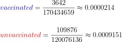
The top white box contains the number of infections observed during the study. We can use All Ages. The Unvaccinated and Vaccinated infections for All Ages were 109,876 and 3,642 respectively. Just as before, we need the person-days (the total time observed) for both. These are provided at the bottom of the table and for the Unvaccinated and Vaccinated they are 120,076,136 and 170,434,659 respectively.
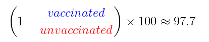
Taking a look at our approximate ratios calculated, you can see that 91.5 in the red square in the table corresponds to our calculated unvaccinated rate, and similarly 2.1 in the blue box corresponds to our calculated vaccinated rate. We would simply need to multiply both by 100,000, as they are incidence rates per 100,000 person-days, to make them about equal to the table.
The next step is identical to the Pfizer phase three trial. “Vaccine effectiveness estimates were calculated as (1 – IRR) × 100” (Incidence Rate Ratios, IRR)
Our calculation appears to be 1.1% higher than that in the table. There are two possible explanations. One explanation may be that when they corrected some hard values they failed to update the efficacy calculation. The second explanation is that the authors ran the raw data, which we do not have, through a particular statistical package3 in order to estimate the bounds (numbers in parentheses, giving some wiggle room to the estimate), which gave them a more nuanced estimate for the central incidence rates than the numbers they provide the reader allow — as our calculated incidence rates are clearly in agreement with the table.
This isn’t too important, as these are simply estimates the authors are making based on observations. These estimates will change over time and with different populations. They are very useful to have, but should not be treated as if they’re exact.
They are also not where the major issues arise. One can simply look at the raw numbers without calculating the efficacy number and conclude that indeed, infection rates were substantially lower. The differences that remain in their calculation for efficacy percentage are negligible.
Next, however, we move to what will ultimately be the source of misinformation. It isn’t the fault of the report itself, but a consequence of too many people who pretend to speak from knowledge and authority interpreting numbers they do not understand.
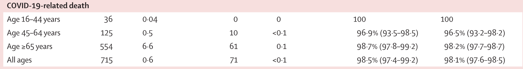
Included in the study are rates of symptomatic COVID, hospitalization, severe hospitalization, and their respective efficacy calculations. At the bottom of the table are efficacy calculations related to death. We will use the table to make one final efficacy calculation so we can move to discussing this horrific source of misinformation.
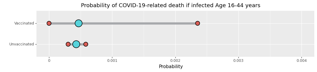
We are given 36 deaths among those aged 16-44 in the unvaccinated group and 0 deaths in the vaccinated group. We have 88,938,310 and 61,397,072 person days for unvaccinated and vaccinated respectively from the bottom of the table. This gives us, indeed 100% efficacy!
100% Efficacy! That’s 100% protection against death! Those between the ages 16-44 cannot die from COVID! You can see how impossible it is for someone to die if vaccinated, as they do not even provide a range of uncertainty. 100% with no uncertainty is as certain as you can get.
The Fatal Flaw (pun intended)
It is obviously possible for vaccinated people 16-44 to die from COVID. The other results from this efficacy from death calculation are just as flawed, and are being dangerously misused. Let us revisit Dr. Tom, the former CDC director.
Hyper-vigilant mass-vaccination advocates have been using the vaccine efficacy “from death” numbers in this Israeli study to claim that if you get COVID you have additional protection because of the vaccine. Some may quote the percentage (“it’s 96% effective at preventing death!”) so as to not be accused of inventing their own numbers. But if you have made it this far, you have performed the efficacy calculation three separate times now. Counting things and dividing things counted.
Nowhere, at any time, in any way, did we look at how many people in the vaccinated group got COVID and died. We (and the authors of the study) counted the number of deaths among the vaccinated, and divide by the number of days, not the number of infections.
And if we do actually look at and compare deaths among those actually infected we get a completely different story.
The efficacy numbers are misinformation
Every single additional efficacy number is redundant. All reported results downstream from infection are a consequence of reduced infections4. The efficacy rates would all be in the high 90s even if the vaccinated group were perfectly identical except for infection rate.
When “former Director of the CDC” Dr. Tom and others use the non-infection efficacy numbers to discuss the vaccines, they are, intentionally or not, misleading the public. It is something that should end immediately.
With the exception of infection rates, the efficacy numbers convey no useful information to citizens about their risks once they have been vaccinated. Instead, it may cause the vaccinated to place themselves and others at greater risk if they operate on this misinformation.
The efficacy numbers, other than infection, which are all downstream effects of infection, are being used and accepted as if they are additional, layered benefits at every stage of COVID infection.
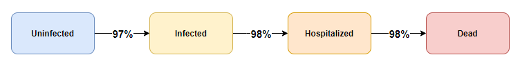
This diagram is how they are being communicated and how they are being received by the clear majority of public figures and citizens. If you are vaccinated it is being communicated that the study showed that you are:
>90% less likely to get infected — true
>90% less likely to get symptoms if infected — false
>90% less likely to become hospitalized if you develop symptoms — false
>90% less likely to become severely hospitalized if you become hospitalized — false
>90% less likely to die you if become severely hospitalized — false
If the efficacy numbers were layered measures of additional protection then the observations would have been different in the Israeli study (All Ages)5.
With numbers this small, these differences may seem negligible. But when scaled up not just across populations but also across time, the impact of affecting people’s decision making when choosing what level of infection risk to assume, can dramatically alter the situation.
These are currently Acceptable Catastrophic Errors being made each and every day by nearly everyone. It is hard to fathom how much more wrong someone could be yet still maintain their credibility after this. But because these are acceptable catastrophic errors, if I am successful in clearing up confusion, those spreading the misinformation will simply move on to the next acceptable catastrophic error.
What the numbers really showed
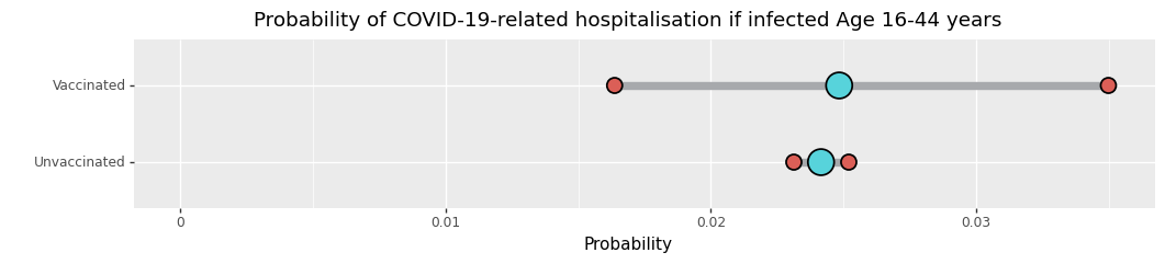
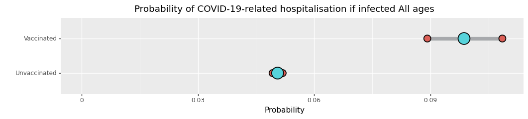
When you actually take a look at who was infected and who died by age group, the idea of additional protection disappears for most.
When you are finally counting things and dividing things counted which matter, such as how many infected people went on to die in each group, no remnant of the 90% numbers remain. In the graph above6, there is no information available to suggest the death rate per infection is any different in the vaccinated group compared to the unvaccinated group. You can see why by revisiting the number infected and the number who died in each group.
36 of 84611 in the unvaccinated versus 0 in 1066 in the vaccinated group. 36 in 84611 is roughly 1 in 2350, but we only had 1066 infected in the vaccinated group. There is not enough information to claim the death rate per infection is higher or lower, and that uncertainty is indicated in the graph above. That is worlds away from the relative immortality communicated by the efficacy number 100%.
In fact, if there had been 24 deaths in the vaccinated group the efficacy reported would have been 3%! Because it was looking at rates over time, 24 deaths would have been the death rate over time similar to 36 in the unvaccinated group. But clearly, among those infected, 36 in 84611 is a far lower death rate than 24 in 1066!
The death rate for the ages 16-44 among infected would need to have been almost 53 times higher to report the vaccine was 3% effective at preventing death.
More graphs
Let’s look at some other situations.
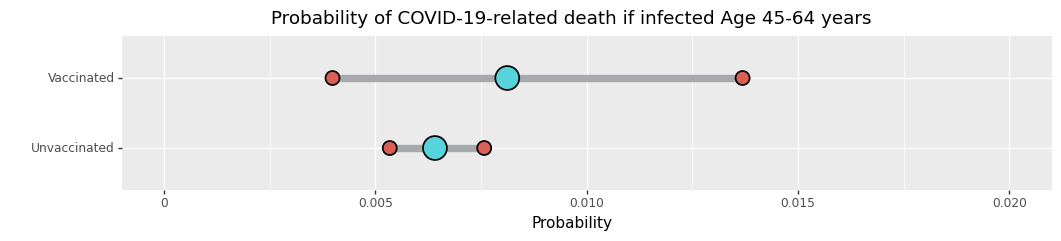
For ages 45-64, there again isn’t enough evidence to conclude that the infection/case fatality rate is any different, but as the bluish dots indicate, the numbers we have actually lean towards a higher death rate among the vaccinated.
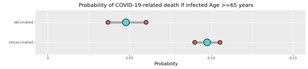
The silver lining though is that among those 65 and over, the observed death rate in the trial gives us decent reason to believe that maybe the vaccine can reduce the death rate for this group. Since they were the most vulnerable all along, this is a promising result.
Post hoc ergo propter hoc
If you were to notice that a number of people died after vaccination, and inferred that the vaccine must have caused the death, you would be committing what is known as the “post hoc ergo propter hoc” fallacy.
This is a simple enough fallacy to explain. Just because B happened after A does not mean B was caused by A. Causation requires more knowledge to deduce.
If you were to commit this fallacy communicating concern over vaccination you would be quickly told by pro-mass-vaccination advocates of this flaw in reasoning. However the same error is committed by the pro-mass-vaccination crowd without any internal pressure checking the reasoning.
We have great reason to assert a causal relationship between decreased infection rates and vaccination. The mRNA vaccines were designed to have a causal mechanism of interaction. Observing the intended effects of the causal mechanism on the macro level (fewer infections) is reasonable to attribute to the engineered mechanism on the micro level.
We have far less reason to assert causation downstream from preventing infection. The pro-vaccinate-everyone crowd has used their incorrect understanding of how the efficacy numbers were derived, and made post hoc ergo propter hoc arguments with them. Even when the data does not show any difference, a misreading and misunderstanding of efficacy numbers is automatically combined with post hoc ergo propter hoc reasoning, compounding errors.
These are all Acceptable Catastrophic Errors, unfortunately.
The dangers of efficacy misinformation
On any given day on social media, you can find someone who has been vaccinated saying they contracted COVID, and they just know that but for the vaccine they would have been in worse shape. These announcement get shared widely. It is wonderful that people have avoided some of the worst symptoms, but the data has not supported the observation that the vaccine offers significant downstream benefits for most people.
The repetition of this false idea, that there are amazing and significant additional benefits outside of mere reduced infection rates, will result in people taking increased risks.
The person who incorrectly assumes that “with the vaccine, even if I get infected I am less likely to die than I would be without the vaccine,” will be more likely to engage in behavior that risks infection. They may become the “it’s just a flu bro” of the vaccinated.
If the lack of observed layered protection were made more explicit then people may choose to still wear masks and social distance, to further reduce their exposure in addition to vaccination. They may choose to go to fewer social events. This in turn would reduce the infection rate, and reduce the probability a mutation that evades vaccination finds a host to practice on. (While writing this article, the White House changed its masking recommendation for the vaccinated)
Those who strongly believe everyone should get vaccinated may still choose to promote the efficacy numbers as additional layers of protection, because their goal is to encourage people to get vaccinated. Misleading use of numbers in advertising is a tale as old as time. But they are doing so at the cost of both their honesty and integrity, and sacrificing some of the actual benefits that vaccination provides, by giving people incorrect information to base their choices on.
Individual probabilities vs rates over time
Those who like to say “the numbers speak for themselves” are the least likely to understand what the numbers are saying. The studies that make epidemiological assessments are reporting to a different audience than the numbers reported are being presented to. To the extent that some studies may exist where these values are calculated conditionally, they are incompatible with the ones that have been computed unconditionally. This information is unlikely to be contained in the spreading of these numbers, as they are more often going to be used interchangeably.
The wrong audience
A hospital trying to plan resources and staffing cares about the estimated daily hospitalization and death rate given how many people are vaccinated. A policy maker deciding among options to fight coronavirus, cares what the daily rates are for various metrics after a policy is adopted.
An individual, for the most part, does not care about the daily rate in the population. They care what their own odds, or those of their loved ones, are.
It does not matter to an individual if the daily observed rate of infection is low across all people, if they themselves are at significantly higher risk. However, absent other measures that can guide an individual risk assessment, a report of daily infection rates if vaccinated compared to unvaccinated does give someone a useful measure at the level of making the choice to get vaccinated.
But once an individual becomes vaccinated, the daily rate of hospitalization, or the daily rate of death, is meaningless. Except in the extremes, such as a resources being exhausted, the daily rate of death has zero relationship to an individual’s chances of death once infected. The individual needs to know their probabilities if they ultimately become infected.
We’re being set up for disaster
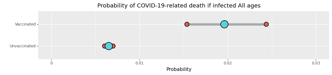
At the beginning of this article I teased that the data show that death rate among the vaccinated and infected is higher than that of the unvaccinated and infected. This is true for death and also true for hospitalization.
There is no sleight of hand or trickery involved. These results are plain as day in the Israeli data if anyone had cared to look. It’s just the result of counting things and dividing things counted that people actually wanted to know about. Not only that, but these results are logical, and now easily predictable. They are also happening elsewhere and are causing confusion.
Why are the infection death rates higher?
The reason, hidden in plain sight, is that a large number people who were never going to die, are no longer getting infected.
By obsessively spreading the misinformation that people have additional benefits to protect against death if they become infected, in order to encourage everyone to get vaccinated, it becomes a unknown fact those most likely to die (6.6 in 100,000)7 are now most likely to get infected (2.5 in 100,000).
Contrast that with those who were least likely to die (0.04 in 100,000) are now those least likely to get infected (1.7 in 100,000).
And these results are now being reflected across the globe. In the UK, which is tracking variants, reports that among Delta variant cases, those vaccinated with two doses died at a rate of 0.0078 per infection and those unvaccinated died at a rate of 0.0014 per infection. The death per infection was 5.7 times higher among the vaccinated.
Without careful control and understanding, one might erroneously conclude the Delta variant is is more lethal if you’ve been vaccinated, the vaccine is losing its efficacy, the vaccination is making people weaker, or some combination. While any of those are possible outcomes in this environment, by not being aware of the infection death rate issue from the start, because one is busy spreading misinformation about extra levels of protection that the data do not support, one misses how to properly control for these effects and analyze new data as it comes in.
The death rate if infected was always going to be higher in the vaccinated groups if most of the vaccinated were those likely to die in the first place.
Those darn Acceptable Catastrophic Errors
Some people may simply shrug when this issue is pointed out to them. Some who understood at a casual level the that efficacy measures were rates over time, may simply not understand the big deal about using them to promote the vaccines. To some degree the vaccines change the probability someone who takes them will wind up dead from COVID. Is it really a big deal that the numbers are all double, triple, and quadruple counting decreased infections as additional benefits downstream? Is it really a problem if you tell a person they’ll be 100 times less likely to die if they get COVID and are vaccinated if that convinces them to get vaccinated?
The authors mention they use a negative binomial regression in Stata to calculate the confidence intervals, and it is possible their point estimate also is a byproduct of this regression. Without access to files to re-run the regression, at this time it cannot be said if it is error, or the regression, that is the source of the difference.
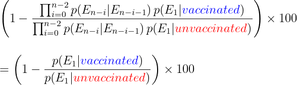
This can be proved or demonstrated in many ways. But for those with familiar a bit of probability theory. If E_n is any chosen downstream event and E_1 is infection
Without significant effort to untangle downstream effects, the efficacy numbers other than infection will be repeating the infection efficacy.
The evidence that exists in this data that among those 65 and older vaccinated of a decreased death rate around 50% cuts their rate to around 3.3 in 100,000. This is good, but still far higher than the other groups and enough to create the end result.
Your post is likely to be severely misinterpreted. I’ve already seen people sharing it with the takeaway comment that, “The real world data has shown that the death rate among the vaccinated, if infected with COVID, can be 3 to 5.7 times higher than the death rate of the unvaccinated.”
A majority of people will read that as saying that the vaccine makes you 3 to 5.7 times more likely to die of COVID. Some of those who read more carefully will notice the “if infected” and interpret it to mean that if you catch COVID-19 after being vaccinated you are 3 to 5.7 times more likely to die than if you had caught COVID-19 without being vaccinated. As you point out in the “More graphs” section, and as discussed in the comment by Sandra and your response, THAT’S NOT WHAT IT MEANS.
The 5.7 is a completely meaningless number found by dividing the fatality rate in a group roughly half of whose members are over 50, by the fatality rate in a group only 2% of whose members are over 50. It is dividing apples by oranges. It says nothing about how getting vaccinated affects the chances of an individual dying if they get COVID-19. If the only confounding variable were whether someone were over 50, then the data in that table would imply that if you are over 50 and you get a breakthrough infection you have a 1 – (220/13,427)/(131/2,337) = 71% LOWER chance of dying than if you had gotten infected without being vaccinated, and if you are under 50 it is 1 – (4/15,346)/(34/119,063) = 9% lower, with wide confidence intervals on both. (This is a nice example of Simpson’s paradox — the trend in each group is different from the apparent overall trend.) There are many other confounding characteristics, such as finer breakdown of age, comorbidities, immune strength, etc, that are likely to correlate both with the chance of a breakthrough infection and with the chance of dying if infected, so after correcting for them it is likely that vaccination decreases the chance of death if infected even more. Of course you are correct that there’s no reason to believe the decrease is as much as 95%, and certainly the data that is being presented doesn’t show it, but none-the-less, it is very likely that there is some benefit, and probably a substantial one for the most vulnerable people.
You’ve done an excellent job of explaining why claims of vaccine benefit for those with breakthrough infections has been overstated, but most people will not read it all, and will instead come away with a faulty understanding in the opposite direction. Rather than interpreting it to mean that people need to be careful even after being vaccinated, it will be interpreted by many people to mean that they should not get vaccinated at all. I’m sure that is not your intent.
Could you edit your post to replace the assertion about 3 to 5.7 higher death rate with something that is less likely to be misinterpreted?
For now I am going to leave it as is. Given this is responding to people who are deliberately overstating the protection given, the initial shock of a true counterintuitive result is an important tool to help correct it.
I do not make any statements that indicate the vaccine is causing increased deaths – so to the extent people may be misusing the results to make that claim it’s hard for me to completely stop.
If some does use to mislead, and the person they misled reads the article and sees why the numbers are high, they will at least be aware now – unlike before.
I’m not saying your concern is incorrect, but I have seen a lot of shares and discussion and at the moment it is not my assessment that people are walking away with the wrong interpretation. I’m sure some are, but it’s not most, as far as I can tell.
What I mostly see are people who respond to claims that “even if you get covid you’re are a lot less likely to go to the hospital/die” with this article. Which is mostly the misinformation I am trying to help correct.
Do I understand correctly? The initial trials done by the pharma companies showed a reduction in disease but it was a complete mystery why. They did not measure the rate of infection. Combined with the fact that some vaccinated people still got infected, many suspected that it just lessened symptoms but not infection (like IPV polio vaccine). But the results of this study suggest that the trial results are indeed explained by reduction in infection and it has almost no effect on symptoms.
To my knowledge there was no particular mystery. Yes the original trials did not test for infection the same way the later Israeli population study did. The original trials waited until symptoms appeared before they considered it an infection.
“Confirmed Covid-19 was defined according to the Food and Drug Administration (FDA) criteria as the presence of at least one of the following symptoms: fever, new or increased cough, new or increased shortness of breath, chills, new or increased muscle pain, new loss of taste or smell, sore throat, diarrhoea, or vomiting, combined with a respiratory specimen obtained during the symptomatic period or within 4 days before or after it that was positive for SARS-CoV-2 by nucleic acid amplification–based testing”
The Israeli study includes earlier assessments involving positive tests, whether symptomatic or not.
So the original study wasn’t particularly looking to see if it increased or decreased asymptomatic COVID to any degree. Just if those vaccinated became symptomatic and tested positive and at what rate compared to the placebo.
What to make of the information coming out of Florida? “The virus has a new target: the unvaccinated and younger people,” says Mary C. Mayhew, President and CEO, Florida Hospital Association in a recent release. “Previously healthy people from their teens to their 40s are now finding themselves in the hospital and on a ventilator. Regardless of your age, get vaccinated, if eligible! What you heard last year and last spring about this virus mostly targeting seniors and those with pre-existing conditions is not true today.”
The media is echoing this. But the data in this article suggests the opposite — if I’m understanding correctly?
Looking at the definition of “vaccinated” in the Israel chart, it only includes people post 14 days after their second round. It isn’t stated explicitly, but it appears that “unvaccinated” includes everyone else: those never vaccinated, vaccinated with one dose, or vaccinated with two doses but within 14 days of the second.
Isn’t this a much bigger problem? How can we know what the relative risks are for vaccination without knowing the risks during the “actually vaccinated but still counted as unvaccinated” phase? Shouldn’t the data have at least 3 categories? Ideally, each category would have separate counts.
Looking at the first reference, I fail to see how “the death rate among the vaccinated, if infected with COVID, can be 3 to 5.7 times higher1 than the death rate of the unvaccinated”. For example, Table 5 – for <50 group, the death rates are near identical. For >=50 they are 1.638% (220/134.27) for double-vaccinated vs 5.61% (131/23.37) for unvaccinated.
WHAT AM I READING WRONG HERE, I WANT TO UNDERSTAND
There are a lot of things delved into in the article at large. The 5.7 number is the infection death rate of the whole population. “those vaccinated with two doses died at a rate of 0.0078 per infection and those unvaccinated died at a rate of 0.0014 per infection”
I do explain how and why the infection death rate, among the whole population, increases.
That specific phenomenon does disappear when you split the whole population into age brackets.
When you do so, which I go through in the article, most groups do not show a difference in infection death rates. It is only as you get to the older population that any reduction in infection death rate can be seen.
BUT. When you vaccinate everyone, you wind up reducing infections in the people who were never going to die. The young. That means the IFR in the whole population of vaccinated people is higher.
I do not claim this is evidence of vaccine harm – I am alerting people to this to prevent conclusions that may not be true when the IFR rises after vaccination.
Don’t mean to be a pain, BUT: if we look at the entirety of the population, IFRs become 0.78 vs 0.13. However, since the first one is for fully vaccinated people who got covid, and if we eyeball it, vaccinations are about 80% protective, so we can assume that this brings in a reduction of factor 5. From here, IFRs become 0.156 (for all fully vaccinated, regardless of whether they caught it or not) against (can we assume flat-line) 0.13 for unvaccinated.
Assuming this logic is not full of shit, if we now extend it on the two age groups, it suddenly becomes 0.00522 vs 0.0284 for <50s, and 0.5276 vs 5.6 for >=50. The question here is whether the effectiveness goes down or holds across all age groups (the former could make the above somewhat different but I don’t see how it could be significant).
I do break down the age groups for the Israeli data in the article – and show what the IFRs are for each age group provided.
16-44 and 45-64 show now evidence of additional protection. Those 65+ show some, but nowhere near 98%
But when you combine all the age groups – the IFR increases.
This is purely a mathematical effect. And if you don’t notice it exists ahead of time, you could make incorrect conclusions in the future.
I do not claim that the infection death rate being higher is a problem – I claim not understanding it fully (by spreading misinformation) can lead to misreading the numbers in the future. Mistakenly concluding the virus is getting more lethal when it isn’t (because you never noticed the higher infection death rate in the original data)
I also argue the false information can lead people to take more risk getting infected than the otherwise would.
The total population IFR should not be considered here, given that we know that the fatality rates increase with decades of life, reliably and consistently, without vaccines. It follows that only age group specific IFRs should be considered with this data (see https://en.m.wikipedia.org/wiki/Simpson%27s_paradox)
Dr Aseem Malhotra’s Testimony on Human Rights Violations against the Finnish Government Introducing COVID-19 Vaccine Passports BY THE EXPOSÉ ON APRIL 23, 2024 On 2024April12, Dr. Aseem Malhotra’s gave testimony to the Helsinki District court as an expert witness on...
A perfect opportunity for Putin to purge the 5th columnists Fingers crossed? EDWARD SLAVSQUAT APR 21, 2024 “Record percentage, record turnout, minimum violations,” TASS trumpeted after Putin’s landslide victory in last month’s presidential elections. To describe the...
Professor Valentina Zharkova and the Little Ice Age Which Has Already Started Astrophysicist Professor Valentina Zharkova explains that instead of CO2, it is the Sun that drives the climate change and because of its decreasing activity we should be ready for a colder...
NER: This is a long read, but you will learn how the evil elite of England, caused the Russian, American & French Revolutions, control America & have ruled the world for 200 years. How the British Invented George Soros, Color Revolutions and Communism: Noor...
How Ivermectin Trials Were Designed to Fail Despite the proven efficacy of ivermectin in treating COVID-19, some studies in top-tier journals have concluded otherwise. Which data should we trust? By Yuhong Dong, M.D., Ph.D. 4/10/2024 Health Viewpoints The use of...
We are Living in a Bizarro, Twilight Zone, Zombie Apocalypse Nightmare. Exhibit A: Alejandro Mayorkas April 18, 2024 By Wayne Allyn Root I swear we are living in some kind of bizarro “Twilight Zone” episode. Or a zombie apocalypse nightmare. Things are that bizarre in...
Massive Rallies Break Out in Japan Against WHO’s Pandemic Treaty. – ‘Don’t Underestimate the Japanese’ BY PATRICIA HARRITY ON APRIL 15, 2024 “Let’s stop the third atomic bomb with our hands, in the hands of the Japanese people!” April 13, 2024, will be etched in the...
NER: Many people reject the concept of shedding of the death shots from the vaxxed to the unvaxxed. It does seem an unlikely thing, but those specialists who have identified it are highly credible. Big Pharma will be putting out the normal pletora of lies about it,...
Peter Gøtzsche: Scientists must stand up to governments who act against the evidence BY RHODA WILSON ON APRIL 13, 2024 Cochrane Collaboration co-founder Peter Gøtzsche has written an article that reads as an open letter to scientists the world over. “Looking back, it...


Aug 10
Thank you.
For now I am going to leave it as is. Given this is responding to people who are deliberately overstating the protection given, the initial shock of a true counterintuitive result is an important tool to help correct it.
I do not make any statements that indicate the vaccine is causing increased deaths – so to the extent people may be misusing the results to make that claim it’s hard for me to completely stop.
If some does use to mislead, and the person they misled reads the article and sees why the numbers are high, they will at least be aware now – unlike before.
I’m not saying your concern is incorrect, but I have seen a lot of shares and discussion and at the moment it is not my assessment that people are walking away with the wrong interpretation. I’m sure some are, but it’s not most, as far as I can tell.
What I mostly see are people who respond to claims that “even if you get covid you’re are a lot less likely to go to the hospital/die” with this article. Which is mostly the misinformation I am trying to help correct.
I will keep your concern in mind though.